Custom WordPress Slider – Coverflow
I got a request from a client to replicate a certain slider and its functionality from a Joomla! website. Found out that the slider is a Coverflow Slider and upon looking on WordPress Plugin Repository I can't find a good one that will work based on the requested functionalities. So I decided to create a custom Coverflow Slider.
The custom slider was built using: Toolset plugin for the Custom Post Type, Bootstrap (for the video modal) and jQuery.Flipster (for the coverflow effect).
Let's segregate the process in to 5 steps:
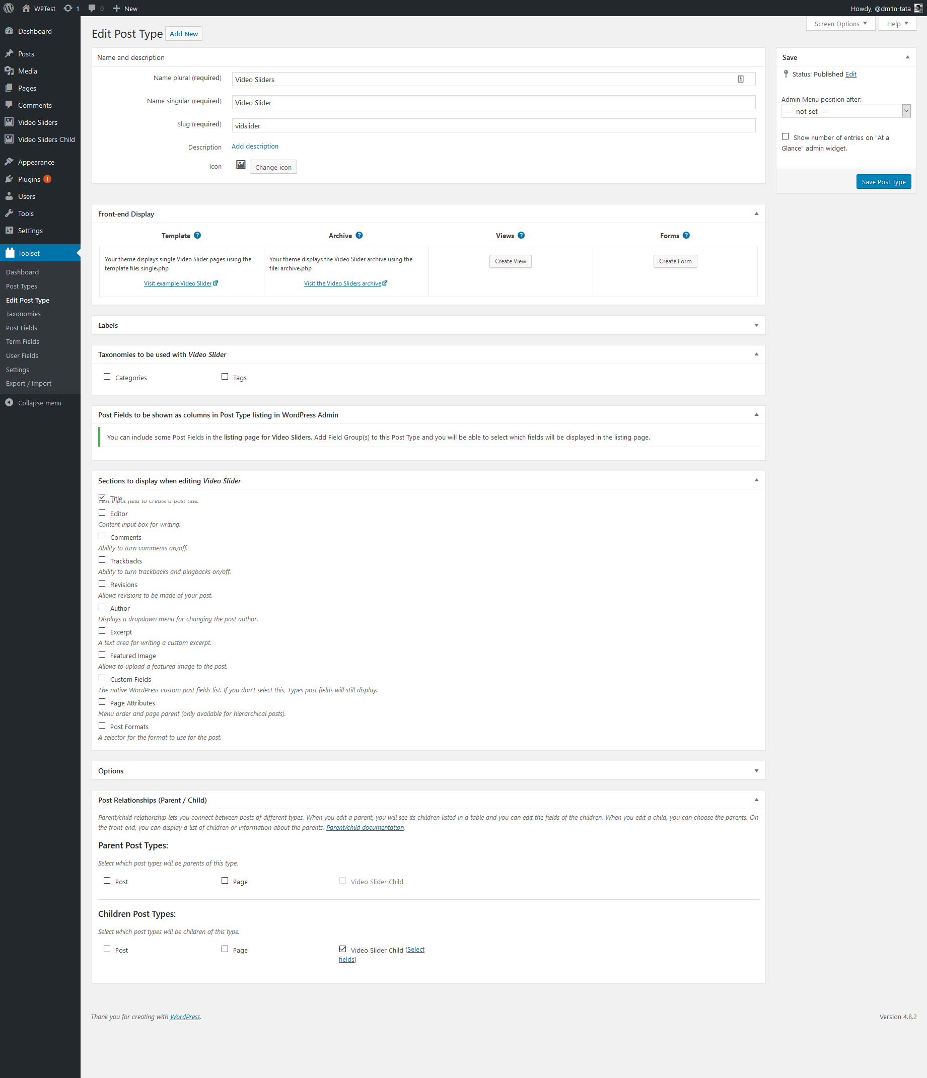
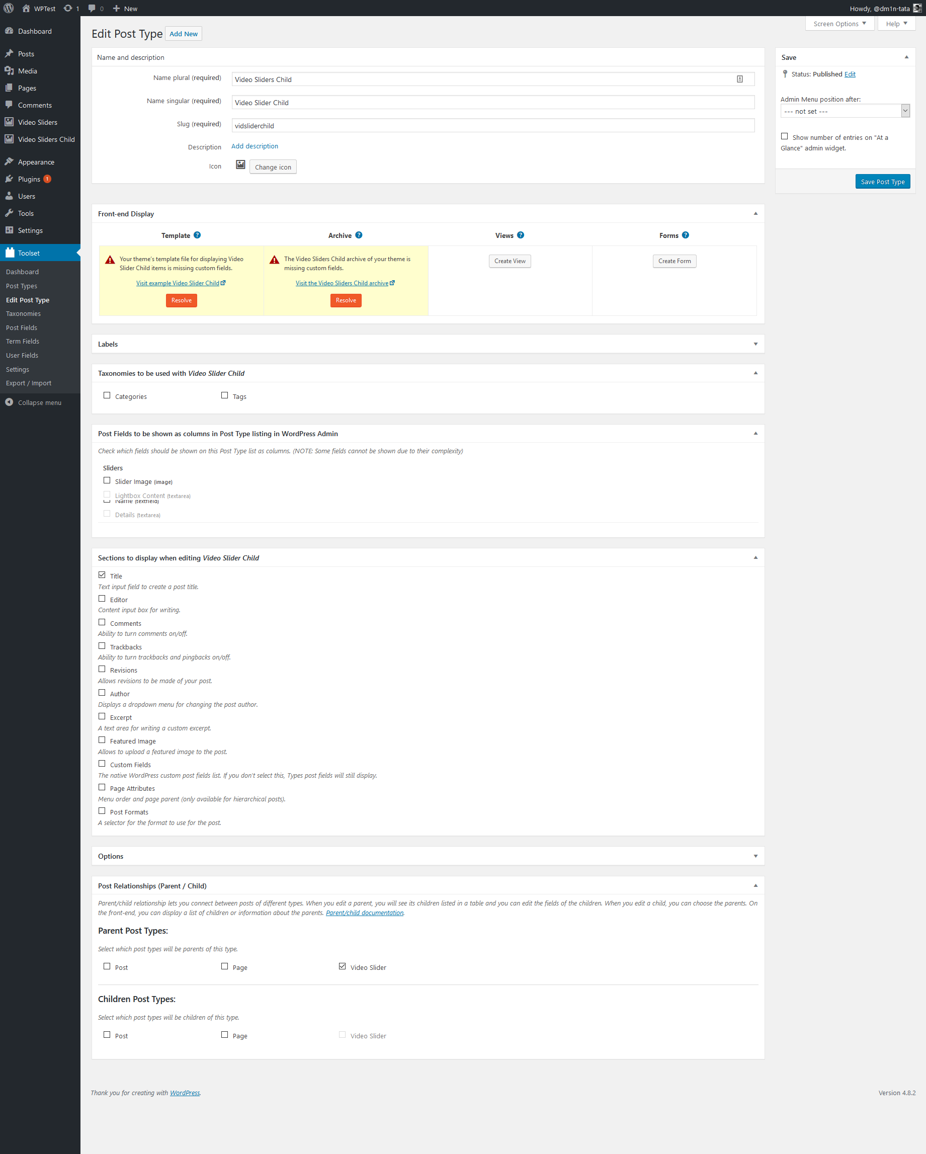
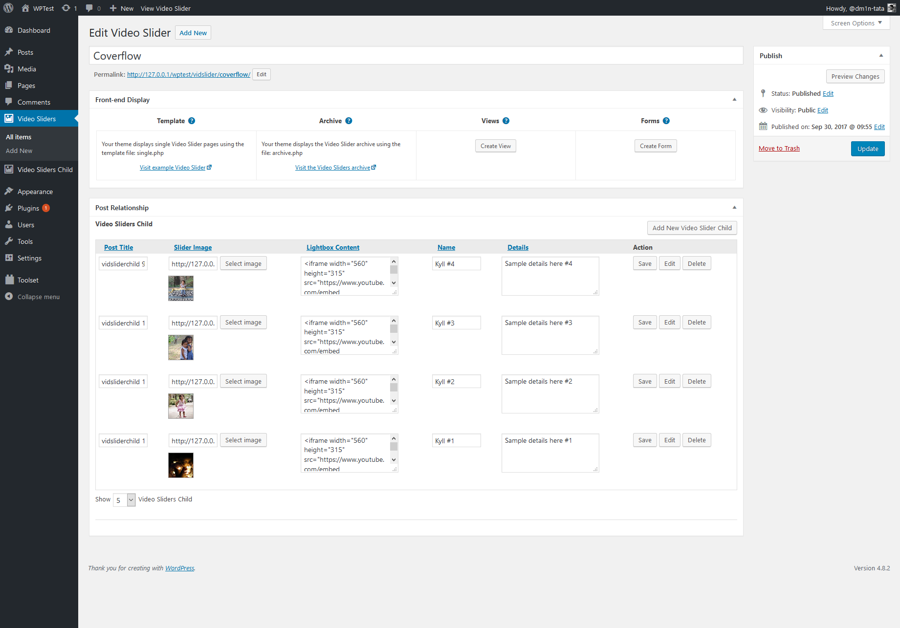
First, Install Toolset and create 2 New post types. Yes, 2 post types because we are going to have it in parent-child relationship to have a Repeating group field in the Parent Custom post type.
Here's the link for the toolset documentation on setting up the repeatable group field using: https://wp-types.com/documentation/user-guides/creating-groups-of-repeating-fields-using-fields-tables/
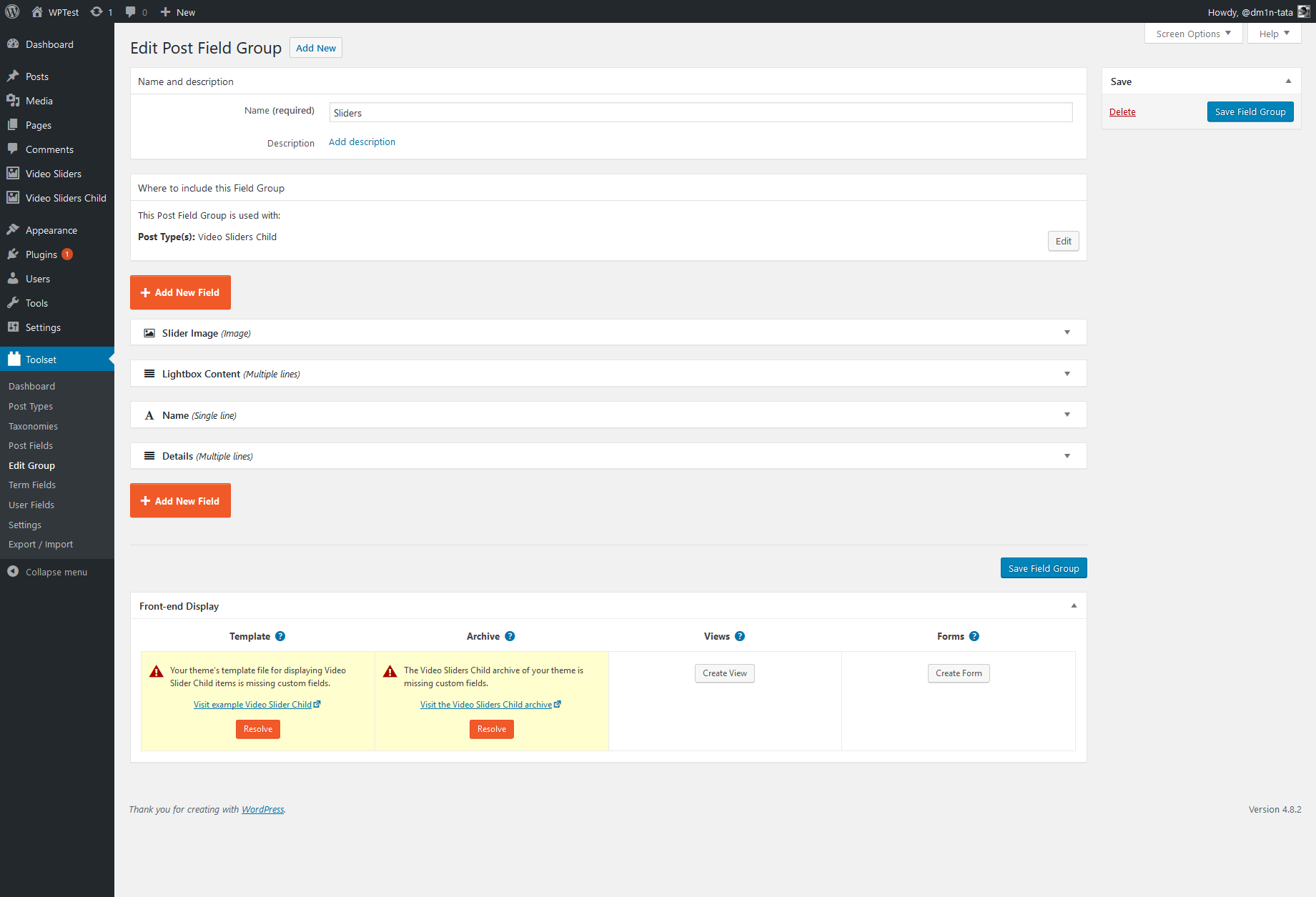
Second, Create the Custom Post fields for our custom post type. I needed four fields to comply with the needed functionality.
1. Image Field - For the background of the slider image.
2. Multiple Lines Fields - for the content of the Lightbox (Bootstrap Modal)
3. Single Line Field - For the Name in the Slider
4. Multiple Lines Fields - for the description in the slider
Third, we now need to add the libraries of jQuery.Flipster and Bootstrap to the theme.
Just add a new folder in your child theme for JS and CSS then add the needed files, here are the links.
Flipster: CSS and JS
Bootstrap: CSS and JS
After adding these files into your (Child) theme files, add this code to your functions.php files.
function flipster_js() {
    wp_enqueue_script( 'flipster_js', get_stylesheet_directory_uri() . '/js/jquery.flipster.min.js', array( 'jquery' ), '1.0', true );
    wp_enqueue_script( 'bootstrap_js', get_stylesheet_directory_uri() . '/js/bootstrap.min.js', array('jquery'), '3.3.7', true );
}

add_action('wp_enqueue_scripts', 'flipster_js');


function flipster_css() {
    wp_enqueue_style( 'flipster_css', get_stylesheet_directory_uri() . '/css/jquery.flipster.min.css', true );
    wp_enqueue_style( 'bootstrap_css', get_stylesheet_directory_uri() . '/css/bootstrap.min.css', true);
}

add_action('wp_enqueue_scripts', 'flipster_css');
Fourth, we need to create the shortcode so we can add the slider anywhere in the website. I have created a pastebin for the Shortcode: https://pastebin.com/0PTRCFUy
Here's also the link to Toolset documentation on how to show the custom fields created thru php which we used in the shortcode: https://wp-types.com/documentation/customizing-sites-using-php/functions/
jQuery to be added in the footer.php
jQuery('#coverflow-flipster').flipster({
    itemContainer: 'ul',
    // [string|object]
    // Selector for the container of the flippin' items.

    itemSelector: 'li',
    // [string|object]
    // Selector for children of `itemContainer` to flip

    start: 'center',
    // ['center'|number]
    // Zero based index of the starting item, or use 'center' to start in the middle

    fadeIn: 400,
    // [milliseconds]
    // Speed of the fade in animation after items have been setup

    loop: false,
    // [true|false]
    // Loop around when the start or end is reached

    autoplay: false,
    // [false|milliseconds]
    // If a positive number, Flipster will automatically advance to next item after that number of milliseconds

    pauseOnHover: true,
    // [true|false]
    // If true, autoplay advancement will pause when Flipster is hovered

    style: 'coverflow',
    // [coverflow|carousel|flat|...]
    // Adds a class (e.g. flipster--coverflow) to the flipster element to switch between display styles
    // Create your own theme in CSS and use this setting to have Flipster add the custom class

    spacing: -0.7,
    // [number]
    // Space between items relative to each item's width. 0 for no spacing, negative values to overlap

    click: true,
    // [true|false]
    // Clicking an item switches to that item

    keyboard: true,
    // [true|false]
    // Enable left/right arrow navigation

    scrollwheel: true,
    // [true|false]
    // Enable mousewheel/trackpad navigation; up/left = previous, down/right = next

    touch: true,
    // [true|false]
    // Enable swipe navigation for touch devices

    nav: 'after',
    // [true|false|'before'|'after']
    // If not false, Flipster will build an unordered list of the items
    // Values true or 'before' will insert the navigation before the items, 'after' will append the navigation after the items

    buttons: false,
    // [true|false|'custom']
    // If true, Flipster will insert Previous / Next buttons with SVG arrows
    // If 'custom', Flipster will not insert the arrows and will instead use the values of `buttonPrev` and `buttonNext`

    buttonPrev: 'Previous',
    // [text|html]
    // Changes the text for the Previous button

    buttonNext: 'Next',
    // [text|html]
    // Changes the text for the Next button

    onItemSwitch: false
    // [function]
    // Callback function when items are switched
    // Arguments received: [currentItem, previousItem]
});
CSS:
.modal {
  text-align: center;
  padding: 0!important;
}

.modal:before {
  content: '';
  display: inline-block;
  height: 100%;
  vertical-align: middle;
  margin-right: -4px;
}

.modal-dialog {
  display: inline-block;
  text-align: left;
  vertical-align: middle;
}


#coverflow-flipster img{max-width: 700px !important; width: 100% !important;}
.flipster__item{float: none !important;}

.flipster__item--current .togglediv{
	position: absolute;
	width: 100%;
	height: 100%;
}

.flipname,
.flipdetails{opacity: 0;}

.flipster__item--current .flipname,
.flipster__item--current .flipdetails{opacity: 1 !important;}

.flipname{font-size: 20px; text-transform: uppercase;}
.flipdetails{color: #aaa;}

.flipnamedetails{
    position: absolute;
    bottom: 0px;
    width: 100%;
    text-align: center;
    color: #fff;
    background: url('	images/textGradient.png') 0 -5px;
    padding-bottom: 10px;
}
.flipnamedetails p{margin-bottom: 0;}
Working Demo


